Author Archives: Andrew Mackie

All Mankind

The Richard Beeston Band (now All Mankind with a fourth band member) needed fresh images leading up to a US tour.

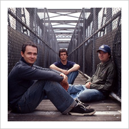
On my recce the previous day, I found a pedestrian footbridge in Silverwater, Sydney – I had no idea what we’d shoot there but I liked the feel. With the guys sitting on the bridge it all fell quickly into place – I brought the camera to their eye level, ensured that all the lines were symmetrical and would all draw your eyes to the same point – disappearing into the distance behind Gavin’s head. Fortunately the weather was mostly overcast which contributed to the muted colour palette (I haven’t reduced the colour saturation) and helped ‘cool’ the image down, bringing out the blue in the steel. For some reason the end result makes me think of The Bronx, or at least as I imagine it from television shows of the 70s and 80s.

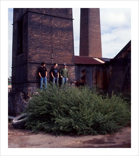
In the morning we’d spent our time at an abandoned brickpit in Eastwood – as kids the band members had played here, so they knew it better than they, er, should. We took shots in multiple locations but this one stuck as something quirky that could be used as a back cover image. I didn’t know why I liked it at the time (and I still don’t) – but it worked well enough for it to be used.

Visualization resources

Websites:

Talks:
Tools:
Books:
Conferences / Community
Consultants / Creators:

Lofoten Islands, Norway

In my twenties I lived vicariously through Climbing magazine, a glossy publication that granted me access to the world of mountaineering and sport climbing through images like these. The September 94 issue had stunning images of the granite walls of the Lofoten Islands that I dreamed of visiting and climbing. A decade later we had the opportunity to visit Norway and finally see (but not climb) these walls.

We flew to Oslo and took the train to Bergen, a pleasant but uneventful town. Then we boarded a Hurtigruten ferry, a coastal service that provides mail, vital supplies and transport to those who live in isolated coastal townships.

Richard With ferry Norway

As we approached Bodo, we crossed the Arctic Circle – this image was taken at around 2am:

From Bodo, we took the ferry to Svolvaer Harbour in the Lofoten Island of Austvagsoya, where a statue of a fisherman’s wife greets returning fishermen and climbers jump across the horns of the Svolvaer Goat. The lattice work in the background are racks where fish are dried to make a delicacy called stockfish.

We hired an old Corolla from a no-frills car rental business and drove toward the tip of the islands, using the bridges that connect the major islands:

And visited lakes where angry Norweigan seagulls made a painful and sustained attack after I walked on their mud flats to take this photo:

The next day we drove to Reine Harbour where we stayed in a Rorbu, a fisherman’s hut. You could even fish from a hole in the kitchen floor.

And this was taken at around 1am from the southernmost point on the island of Moskenesoya:

We then drove back to Svolvaer, took the ferry back to the mainland and boarded a train back to Oslo. As a holiday it was painfully expensive but exceeded my expectations, even those built up over a decade.

A slice of innovation

Here’s proof that there’s room for significant innovation in almost any product:

The standard pizza box design considers only one half of the problem space – pizza vendors and their need to transport pizza away from their premises. With the Green Box, eco incorporated looked at the needs of the end user – plates to eat from and storage for leftovers – and created environmental benefits as well. Brilliant.

A little more of the story is available from their short presentation at Pitchfest and thanks to Stuart for the link.


Needing to explain it

If you made this tap for use in a public bathroom, you failed. You chose to be different in a way that prevents instantaneous access to water for novice users. It’s not enough to be different – as Marty Neumeier says, you need to different and good.

If you put up the sign, you failed. You heard the complaints from the public but decided that they were wrong and the tap wasn’t broken. Instead of spending your time providing a tap that they could use instantly, you decided to spend five seconds of their time learning to use a tap that’s not fit for the purpose.

Rub-a-dub-dub


In my first year of as a commercial photographer, I wanted to make a dedicated image to put on my client christmas cards, something that spoke to creativity and technical proficiency. Somehow I came up with ‘Rub a dub dub, three men in a pub’ and convinced a pub and five people to help me make it. The butcher really was the local butcher, the baker is my uncle and the suitably mad candlestick maker a friend from church. Makeup was done by a student artist and another friend helped me move all the gear.

The only natural light in the scene is the light globe at the very top right. The foreground was lit with three studio strobes, including a (then) brand new type of light reflector that provided a large, directional light source to simulate sunlight (through the windows of the bar). The background (the bottles in the bar) were lit with a typical camera flash unit on a slave trigger and a sparkler was lit to create a welding spark.

I still don’t know what I think of this image – as I made it completely from scratch it’s one of the images I feel most naked showing to other people. It took a long time to make and used more of the models’ time than I had hoped, particularly the butcher who needed to get back to his shop (and he couldn’t even drink his beer because I’d put salt in it to keep its head). Plus there are a number of technical flaws that I won’t point out but personally can’t ignore. Fortunately, however, my clients loved it.

Hate me, but don’t ignore me

This 4 minute Cool Hunting video looks at Sao Paulo’s prolific graffiti artists:

A summary of filmmaker / journalist Jaoa Wainer’s points (with my comments in parenthesis) is:

  • tags made without the risk of climbing are not valued (this tribe demands commitment from its participants),
  • the tag is made up of a personal symbol, a gang symbol and the date (the artist is claiming current membership in their gang, and presumably ownership of a neighbourhood),
  • the artists are the invisible poor who say ‘I’d prefer you to hate me than ignore me’ (to me the most significant point here),
  • the tags are in a common style that dates back to the 1980s (the artists are aligning themselves with each other even over gang boundaries and the tags only understandable only by those in the culture),
  • the symbols are based on the logos of heavy metal bands (the artists belong to a wider tribe – youths around the world who have an affinity with heavy metal presumably because it expresses their feelings), and
  • the artists don’t know why they do it (self-awareness is a not a prerequisite to action against deeply held values).
For me it’s another reminder that nothing is as simple as it looks. Even cultures that most do not value contain the same degree of structure, purpose and value for its participants as esteemed cultures. And that unless the powers that be get inside the skin of these cultures as Wainer has here, they’ll never have an impact on curbing anti-social behaviour. Malcom Gladwell also speaks to this in The Tipping Point.
p.s. Thanks to Jonathan for pointing me to Matt Mason’s book The Pirate’s Dilemma. It discusses the links between graffiti, sub-cultures & advertising and is downloadable at the price of your choice. I also recommend Matt’s Pop!Tech talk on piracy.

Generosity

As the web has exploded, so has generosity. I think there’s at least three kinds of generosity that we see today:

I can’t use it so you have it.
This is where the giver can’t benefit directly from what they own and therefore gives it freely, often to obtain an indirect or non-tangible benefit. Two examples might be the author who gives away part of a book to increase book sales, and the blogger who gives away small ideas in the hope of building a reputation or tribe.

I won’t miss it.
This is where the giver could directly benefit from what they own but it represents only a marginal benefit to them (and therefore only a marginal cost to give it away). The patronage of the wealthy, tipping and a $25 loan on kiva.org might be good examples.

Your need is more important than mine.
This is the traditional view of generosity, where the giver gives in spite of incurring a significant personal cost to do so.

Proportionally speaking, the vast majority of generosity used to be either ‘I won’t miss it’ by the very wealthy or ‘your need is more important than mine’ because prior to the web the costs of facilitating gift-giving were very high, making the smaller transactions inefficient. Sharing an idea with the public required buying media so only the most important ideas were shared. The end-to-end cost of completing a gift transaction meant that only large gifts were efficient. And the cost of near-perfect information (will my intended recipient receive my gift?) meant that certainty was available only for the large foundations or large-scale charities who could afford to chase this information down. These inefficiencies prevented the smaller scale and ‘I can’t use it so you have it’ generosity that we see today.

Are all three kinds true generosity, however? I’m a traditionalist here – I think true generosity is ‘your need is more important than mine’, where the giver incurs a real cost in making their gift. Regardless, all three forms of generosity should be valued not as moral credit to the giver but as realised benefit to the recipient – even something useless to the giver can be another person’s treasure. Whatever the giver’s motivation or cost, we can all be thankful for the explosion in generosity that we enjoy today.

p.s. Clay Shirky has some good thoughts on designing for generosity which have no doubt inspired mine.


Harbour Bridge

Taken at 2am on a warm summer night, this is a structural element of the Sydney Harbour Bridge.
I had spent an hour or so wandering back and forth along the pedestrian walkway looking for the right element – I wanted something minimal and strong. Following 9/11, a security guard patrols the bridge at night and on his first pass I was greeted with suspicion and a bag search. By his second and third pass, he realised I was serious about getting an image and I became a welcome distraction.
At this time on a weeknight, few vehicles cross the bridge but each causes noticeable vibration – a problem for a one minute exposure on a relatively long lens (165mm on a 6×7). As I couldn’t anticipate the arrival of vehicles, the first few were ruined by buses and trucks passing so I kept shooting until I had a vibration-free image. Then I wanted to bracket the exposure and use two film backs for redundancy so all told it took perhaps an hour to capture all of these frames. The long exposure also allowed capture of faint bird trails in the background – in summer birds feast on moths attracted to the lights.
You’re welcome to make a print for personal use: 10×13 inch, 300 DPI JPEG